Greige (the grey-beige hybrid) defined the 2010s and the early 2020s. It's been gracefully aging out for a few years now and 2026 is the year the replacement palettes feel established rather than emerging. Three directions, none of them a single colour. This replacing greige in 2026 guide keeps the focus on proportion, maintenance, and how the room feels in daily use.
In our room edits, the change works only when it solves a visible problem instead of adding another layer to manage. Use the same restraint behind earth-toned palettes and slow living bedroom: measure first, repeat materials deliberately, and leave enough blank space for the change to read.
What is replacing greige in 2026?
Greige is being replaced by warmer, more material-led neutrals: dusty clay, grey-green sage, lichen, mushroom, and pale limestone. The shift is not from neutral to colourful; it is from generic grey-beige to neutrals with clearer temperature and texture. Paint-brand signals point the same way: Sherwin-Williams named Universal Khaki a 2026 warm neutral, Behr's Hidden Gem sits in smoky jade, and Valspar's Warm Eucalyptus keeps sage in the grounded-green family. Use the room's light first: north-facing spaces usually need warmer undertones, while south-facing spaces can handle cooler sage or stone. In practice, that means testing colour beside flooring, trim, and upholstery, not judging a chip in isolation. Start with textiles or one painted test area before repainting the full room, then repeat the new tone at least twice so it reads as a palette rather than an accident.
For this choice, this section matters most when it is checked from the doorway and from the seat or counter where the decision will be seen every day. Give the idea at least 24 hours in normal morning and evening light, then remove one nearby object before deciding whether the room needs anything else.
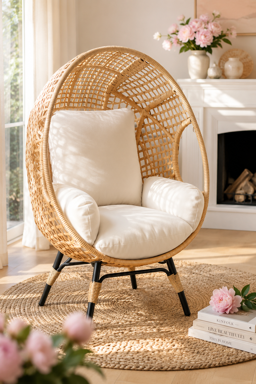
Clay
Terracotta got there first; the 2026 evolution is a desaturated, dusty clay — think the inside of a pottery studio rather than a Tuscan villa. Reads warm without reading rustic, and pairs with both pale wood and dark wood.
Clay is the “safe bold” of the year — it's still a neutral, but it's a neutral with a pulse.
Sage (and its quieter cousin, lichen)
Sage moved from accent to whole-room. The trick is choosing a sage that's grey-green, not yellow-green — the latter dates fast, the former reads as architecture.
Practical
A north-facing room takes a warmer sage; a south-facing room can take a cooler, greyer one. Always sample on the actual wall before committing.
Stone-with-warmth
The replacement for greige proper. The greys are out, but a pale, warm stone — closer to limestone than concrete — keeps the calm-neutral function of greige without the cool cast.
For this choice, this section matters most when it is checked from the doorway and from the seat or counter where the decision will be seen every day. Give the idea at least 24 hours in normal morning and evening light, then remove one nearby object before deciding whether the room needs anything else.
What's not coming back
Cool grey. Slate. The all-white-everything kitchen. Black accent walls.
What unifies the new direction isn't a single hue — it's temperature. The 2020s ran cool; the 2026s run warm. Pick whichever of the three directions fits your light, and stop second-guessing.
For this choice, this section matters most when it is checked from the doorway and from the seat or counter where the decision will be seen every day. Give the idea at least 24 hours in normal morning and evening light, then remove one nearby object before deciding whether the room needs anything else.
Why greige started to feel tired
Greige worked because it solved a real problem. It was warmer than grey, calmer than beige, and easy to specify across open-plan homes. The issue is that it became the default answer even when the room needed a more specific one. Once every wall, sofa, rug, and cushion sat in the same grey-beige middle, rooms lost depth.
The 2026 shift is not about rejecting neutrals. It is about choosing neutrals with clearer temperature and material reference. Clay points to earth. Sage points to leaf and stone. Warm limestone points to plaster and mineral. Those references give a room a sense of place that generic greige rarely managed.
How to update a greige room without repainting
Start by identifying whether your current greige leans warm or cool. Hold a sheet of plain white paper beside the wall. If the wall looks slightly pink or yellow, it is warm enough to work with clay and mushroom. If it looks green or blue, it will pair better with sage, lichen, or warm stone.
Then add one new temperature through textiles before touching paint. A clay throw, olive cushion, walnut tray, or aged brass lamp can shift the room quickly. If the new piece looks separate, repeat the colour once more across the room. Two repeats create intention; one object can look accidental.
Paint pairings that work
Clay wants cream trim, not bright white. Sage wants bone, stone, or warm grey-white. Warm limestone wants wood and black punctuation. The trim matters because it defines how the wall colour reads at the edges. A beautiful warm wall beside blue-white trim will look dirty; the same wall beside cream will look deliberate.
If you are painting only one room, sample the hallway transition too. A warm room off a cool hallway can look abrupt unless there is a shared material, such as oak flooring, brass hardware, or a repeated textile.
What stays from the greige era
The useful part of greige was restraint. Keep that. The less useful part was sameness. Replace the sameness with material contrast: matte walls, linen fabric, rough ceramic, smooth wood, soft wool. You can stay neutral and still build depth.
For palette examples beyond the three broad directions, earth-toned palettes that don't read beige breaks the shift into combinations you can actually sample.
The safest first move
If you are nervous, paint the smallest contained space first: a powder room, a reading corner, the back of a bookshelf, or the lower half of a hallway. The point is to test your tolerance for warmth at human scale. Once the colour feels normal in a small zone, the larger room becomes less intimidating.
For this choice, this section matters most when it is checked from the doorway and from the seat or counter where the decision will be seen every day. Give the idea at least 24 hours in normal morning and evening light, then remove one nearby object before deciding whether the room needs anything else.
How to Use Replacing greige in 2026 at Home
Start with measurements rather than mood. Mark the likely footprint with painter's tape, books, or a folded towel before buying or rearranging anything. A useful rule is to leave at least 60 cm for a main walkway, 35-45 cm between a sofa and coffee table, and 10 cm of visible border around small textiles or objects that sit on the floor. Those numbers are not decorative; they decide whether the idea feels calm once people actually move through the room.
Check the material against what is already present. If the room has several glossy surfaces, add matte texture. If it has many pale fabrics, add one grounded wood, stone, black, or brass note. If it already has strong contrast, keep the new piece quieter. The goal is not to match every finish, but to repeat one material family so the choice feels connected to the room instead of dropped into it from a product photo.
Plan maintenance before styling. Anything near water, food, pets, children, or direct sun needs a cleaning rhythm and a tolerance for wear. Soft textiles may need weekly washing, stone may need coasters, acrylic may need microfiber cleaning, wood may need pads under objects, and lighting may need a dimmer that is compatible with the fixture. A beautiful choice that is annoying to maintain usually becomes visual clutter within a month.
Use the one-in, one-out test after the change lands. Add the new piece, then remove one smaller object in the same sightline. If the room feels more intentional, leave the smaller object out. If the room feels bare, return it after a week. This keeps the edit from turning into accumulation and protects the calm that made the change worth considering in the first place. Used this way, replacing greige in 2026 becomes part of the room's structure rather than a loose accent.
FAQ
How do I use this idea without making the room feel busy?
Use the change as one clear decision, then remove or quiet the nearest competing object. The room should gain a job, a material note, or a focal point rather than another small thing to maintain.
What should I measure before choosing it?
Measure the available width, depth, height, and the walkway that remains after the piece or idea is in place. For most rooms, 60 cm of clear passage and visible breathing room around the object prevents a styled choice from becoming an obstacle.
Can this work in a rental or small home?
Yes, if the choice is reversible and scaled to the room rather than the product photo. Freestanding pieces, textiles, plug-in lighting, removable hooks, and careful styling usually give the best result without changing the building.
What is the most common mistake with this idea?
The common mistake is treating the idea as decoration before checking proportion and maintenance. If the size is wrong or the material is hard to live with, even an attractive choice will make the room feel less settled over time.


