If there is one colour that has defined the last decade of interior design, it is arguably green. As we increasingly seek homes that function as sanctuaries from our fast-paced, screen-dominated lives, we instinctively reach for colours that ground us. While deep emeralds offer moody sophistication, it is the soft, muted greens — sage, olive, and eucalyptus — that offer the ultimate restorative atmosphere.
Muted greens are the cornerstone of biophilic design (the practice of connecting indoor environments to nature). They lower the heart rate visually. They act as a bridge, dissolving the barrier between the living room and the garden outside. Best of all, muted greens are incredibly forgiving; they function as "coloured neutrals," meaning you can treat them with the same versatility as beige or grey, but with far more personality.
For a look at the deeper end of the colour spectrum, see our guide on moody jewel tones. To see how green elements work with organic textures, explore our article on travertine coffee tables. Here is how to master the soft sage palette in your own home.
Why Muted Greens Work Anywhere
The beauty of sage and olive greens lies in their grey undertone. A pure green is vibrant, energetic, and often too stimulating for a relaxing room. When you add a heavy dose of grey, the colour is "knocked back." It becomes muted, dusty, and instantly sophisticated.
Because these colours are pulled directly from the natural landscape, our eyes are uniquely accustomed to them. We don't experience visual fatigue when looking at a forest, and similarly, we don't tire of a sage green room. This makes muted greens suitable for almost any space in the house:
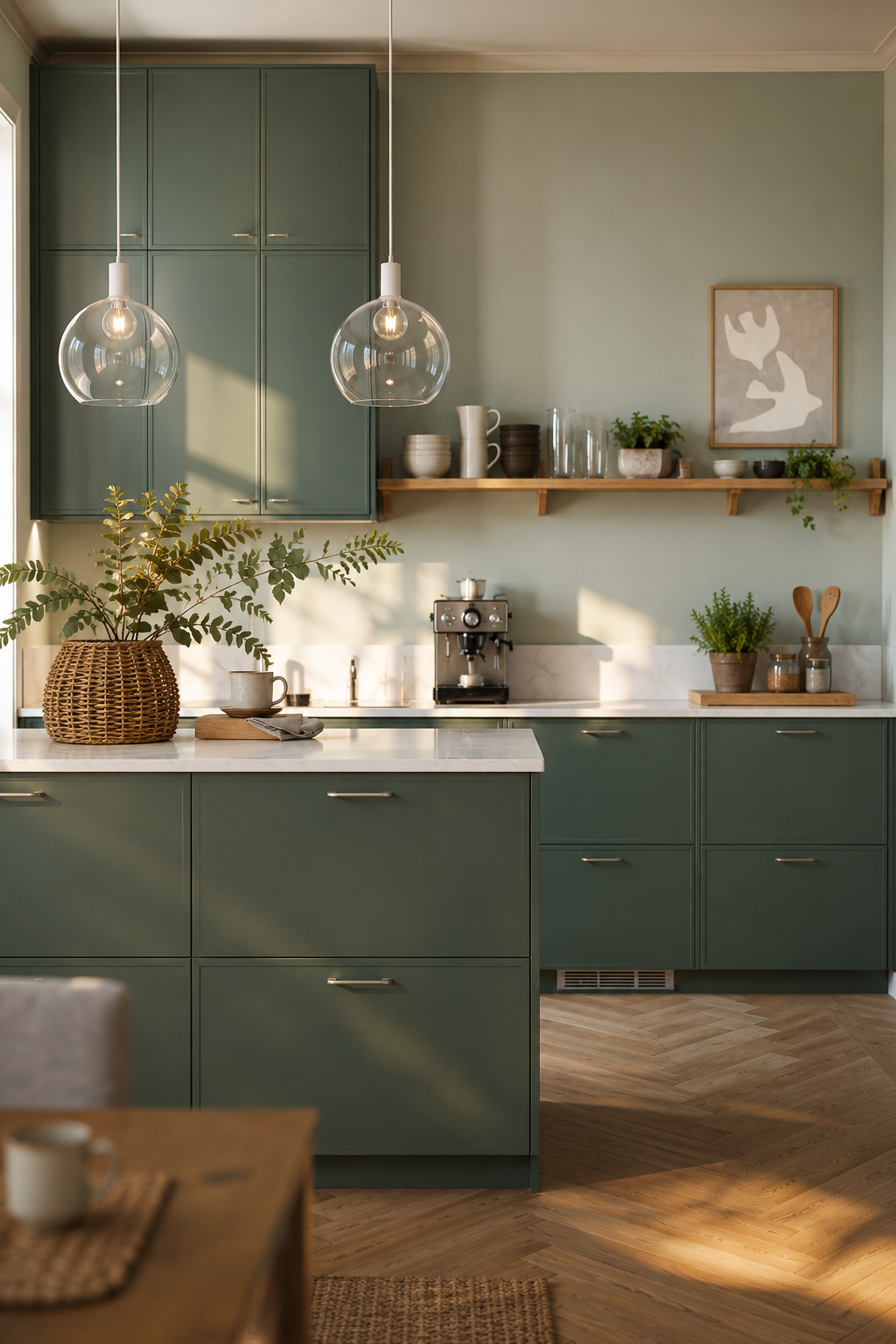
- Kitchens: Sage green cabinetry has become a modern classic, offering a softer, warmer alternative to stark white or dark navy kitchens.
- Bedrooms: The restorative quality of dusty green makes it the perfect backdrop for sleep.
- Home Offices: Green promotes concentration and reduces eye strain, making it an excellent choice for a study space.
Building the Palette
While you can colour-drench a room in sage green (painting the walls, trim, and ceiling the same colour), you generally need supporting characters to bring the palette to life.
1. The Warmth of Wood
Wood is the natural companion to green. In nature, trees are brown and green; it is the most intuitive colour pairing on earth. When decorating with sage or olive, introducing wood tones is non-negotiable.
Mid-tone woods work best. Warm oak, teak, and walnut provide a grounding warmth that balances the slight coolness of the green. Consider a walnut dining table in a sage green dining room, or open oak shelving against a muted green kitchen backsplash. The grain of the wood provides the organic texture necessary to keep the green from feeling too flat.
2. Cream, Not White
When pairing muted greens with a neutral, step away from brilliant, icy white. Stark white creates too much harsh contrast against dusty green, making the green look muddy by comparison.
Instead, opt for warm whites, creams, and oatmeal tones. A sage green wall looks exquisite against a cream bouclé armchair or linen curtains in a natural, unbleached flax colour. These warmer neutrals ease the transition between colours and maintain the soft, calming atmosphere of the room.
3. The Metal Accents
The hardware and lighting fixtures you choose will dictate the mood of the green room.
- Unlacquered Brass: This is the gold standard for pairing with sage. The warm, slightly tarnished gold tone of the brass sings against the green, providing a touch of heritage elegance.
- Matte Black: If you want the green room to feel more modern or industrial, matte black hardware provides a crisp, contemporary edge.
- Polished Nickel: Warmer than chrome but cooler than brass, polished nickel offers a subtle, silvery gleam that looks incredibly fresh against olive or eucalyptus tones.
Avoiding the "Mint" Mistake
The most common mistake when decorating with soft greens is accidentally ending up with a nursery-mint room. When you look at a paint chip in the hardware store, the tiny square of colour is surrounded by harsh fluorescent light and thousands of other colours. A colour that looks perfectly muted in the store can suddenly look like mint ice cream when painted across four walls in your living room.
To avoid this, always choose a green that looks slightly too grey or muddy on the paint swatch. Once it is up on the walls and the light hits it, the green will amplify. Test the paint on multiple walls, as a south-facing window will make the green look warmer and more yellow, while a north-facing window will pull out the cool, grey undertones.
Soft sage and muted greens are not a passing fad. They are a return to natural decorating principles. By embracing these dusty, organic tones and pairing them with natural wood and warm metals, you can create a home that feels like a quiet exhalation at the end of a long day.

