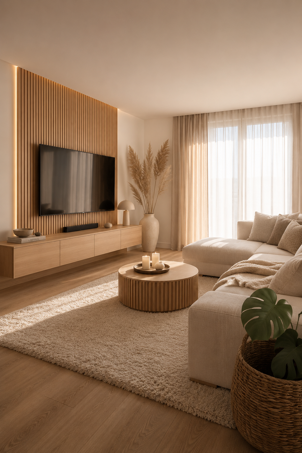
Beige had a long run. From 2019 through about 2024, every "warm minimalist" palette converged on the same five paints, and by the end you couldn't tell a luxury hotel lobby from a Brooklyn dental practice. We're past it. This earth-toned palettes guide keeps the focus on proportion, maintenance, and how the room feels in daily use.
In our room edits, the change works only when it solves a visible problem instead of adding another layer to manage. Use the same restraint behind what is replacing greige in 2026 and slow living bedroom: measure first, repeat materials deliberately, and leave enough blank space for the change to read.
What replaced it isn't drama. It's temperature. The 2026 palettes that feel current borrow earthiness from the natural world — clay, lichen, mushroom, dusk — and let one anchor pigment do the work that beige used to do alone.
Palette 1 — Terracotta + Mushroom + Cream
The opening pair is a soft, warm terracotta against a desaturated mushroom. Cream ties them together. The room reads warm without going pink. It's the safest of the five.
For this choice, this section matters most when it is checked from the doorway and from the seat or counter where the decision will be seen every day. Give the idea at least 24 hours in normal morning and evening light, then remove one nearby object before deciding whether the room needs anything else.
Palette 2 — Olive + Bone + Charcoal
Olive (not sage — olive) carries surprisingly well as a wall colour in north-facing rooms. Pair with bone-white trim and charcoal hardware. The contrast is gentle but real.
Avoid the temptation to add a fourth colour. Three is the limit before earth-toned starts to read country-cottage.
For this choice, this section matters most when it is checked from the doorway and from the seat or counter where the decision will be seen every day. Give the idea at least 24 hours in normal morning and evening light, then remove one nearby object before deciding whether the room needs anything else.
Palette 3 — Dusk + Warm Sand + Burnt Umber
The dramatic one. Dusk is a deep, slightly purple grey-blue — not navy. Read it as the colour of the sky thirty minutes after sunset. Sand on the floors, burnt umber as an accent in textiles only.
When this palette breaks
If the room has cool fluorescent overhead lighting, dusk turns flat. Swap to 2700K bulbs first.
For this choice, this section matters most when it is checked from the doorway and from the seat or counter where the decision will be seen every day. Give the idea at least 24 hours in normal morning and evening light, then remove one nearby object before deciding whether the room needs anything else.
Palette 4 — Lichen + Linen + Aged Brass
Lichen is a dusty greenish-grey. With linen white and aged brass hardware, the result is the closest a room can get to "outside, in spring" without leaning literal.
For this choice, this section matters most when it is checked from the doorway and from the seat or counter where the decision will be seen every day. Give the idea at least 24 hours in normal morning and evening light, then remove one nearby object before deciding whether the room needs anything else.
Palette 5 — Clay + Plaster + Black
The bravest pick. A pinkish clay on lower walls, a chalky off-white plaster above, single black accents (a lamp, a frame). Reads as Mediterranean without being themed.
The common thread isn't colour theory. It's restraint: pick three, repeat them, stop.
For this choice, this section matters most when it is checked from the doorway and from the seat or counter where the decision will be seen every day. Give the idea at least 24 hours in normal morning and evening light, then remove one nearby object before deciding whether the room needs anything else.
How to sample earth tones
Earth tones change dramatically with light. A clay that looks warm in a paint shop can turn salmon in a south-facing room; an olive that looks sophisticated online can go muddy in a north-facing room. Sample on two walls: the brightest wall and the shadow wall. Check it at breakfast, mid-afternoon, and after dark with the lamps on.
Do not judge the sample against a white wall. White makes every warm colour look more saturated than it will once the room is finished. Tape a sheet of natural linen or kraft paper beside the sample so your eye compares it to a real material, not a blank digital-feeling white.
Materials that make the palette work
Earth-toned rooms need texture more than contrast. The reliable materials are pale oak, walnut, raw linen, matte ceramic, aged brass, and wool. Chrome, glossy white lacquer, and blue-white LEDs fight the palette because they pull the room back toward cool grey.
If you already own cool-toned furniture, do not replace it first. Add warmth around it: a clay cushion, a mushroom rug, a wood tray, a lamp with a linen shade. Once three warm materials repeat, the cool piece reads intentional rather than stranded.
Where people go wrong
The first mistake is choosing five related beiges and calling it a palette. A good earth palette has one temperature lead, one quiet support, and one grounding note. Terracotta + mushroom + cream works because each has a job. Beige + oatmeal + sand + taupe + ecru is just indecision.
The second mistake is using black too broadly. Black is excellent as punctuation: a frame, a lamp base, one chair leg. When it becomes the main contrast, the room stops reading earthy and starts reading graphic. That can be beautiful, but it is a different brief.
A low-risk starting point
Start with textiles before paint. A throw, two cushion covers, and a small ceramic will tell you whether you like living with clay, sage, or lichen long before you commit to four walls. If the room feels better after the textile test, paint one small zone: an alcove, the back of open shelving, or the lower half of a wall.
For a trend-level view of the same shift, see what's replacing greige in 2026. The short version: the new neutrals are still calm, but they have a pulse.
How to Use Earth-toned palettes at Home
Start with measurements rather than mood. Mark the likely footprint with painter's tape, books, or a folded towel before buying or rearranging anything. A useful rule is to leave at least 60 cm for a main walkway, 35-45 cm between a sofa and coffee table, and 10 cm of visible border around small textiles or objects that sit on the floor. Those numbers are not decorative; they decide whether the idea feels calm once people actually move through the room.
Check the material against what is already present. If the room has several glossy surfaces, add matte texture. If it has many pale fabrics, add one grounded wood, stone, black, or brass note. If it already has strong contrast, keep the new piece quieter. The goal is not to match every finish, but to repeat one material family so the choice feels connected to the room instead of dropped into it from a product photo.
Plan maintenance before styling. Anything near water, food, pets, children, or direct sun needs a cleaning rhythm and a tolerance for wear. Soft textiles may need weekly washing, stone may need coasters, acrylic may need microfiber cleaning, wood may need pads under objects, and lighting may need a dimmer that is compatible with the fixture. A beautiful choice that is annoying to maintain usually becomes visual clutter within a month.
Use the one-in, one-out test after the change lands. Add the new piece, then remove one smaller object in the same sightline. If the room feels more intentional, leave the smaller object out. If the room feels bare, return it after a week. This keeps the edit from turning into accumulation and protects the calm that made the change worth considering in the first place. Used this way, earth-toned palettes becomes part of the room's structure rather than a loose accent.
FAQ
How do I use this idea without making the room feel busy?
Use the change as one clear decision, then remove or quiet the nearest competing object. The room should gain a job, a material note, or a focal point rather than another small thing to maintain.
What should I measure before choosing it?
Measure the available width, depth, height, and the walkway that remains after the piece or idea is in place. For most rooms, 60 cm of clear passage and visible breathing room around the object prevents a styled choice from becoming an obstacle.
Can this work in a rental or small home?
Yes, if the choice is reversible and scaled to the room rather than the product photo. Freestanding pieces, textiles, plug-in lighting, removable hooks, and careful styling usually give the best result without changing the building.
What is the most common mistake with this idea?
The common mistake is treating the idea as decoration before checking proportion and maintenance. If the size is wrong or the material is hard to live with, even an attractive choice will make the room feel less settled over time.


