A kitchen feels frantic when too many things are vying for attention: a busy backsplash, cool overhead lighting, a forest of appliances on the counter. Three corrections fix most of that without touching the cabinetry. This calm kitchen guide keeps the focus on proportion, maintenance, and how the room feels in daily use.
In our room edits, the change works only when it solves a visible problem instead of adding another layer to manage. Use the same restraint behind lighting upgrades under $70 and small living rooms: measure first, repeat materials deliberately, and leave enough blank space for the change to read.
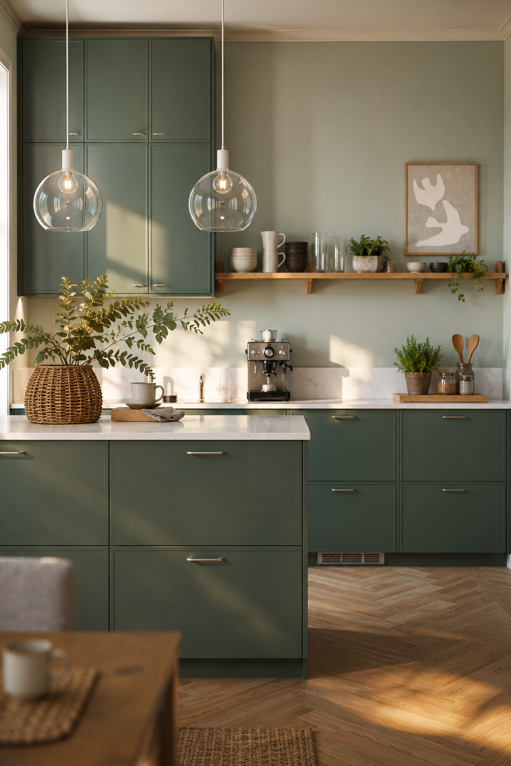
Decision one: counter colour
Whatever your countertops are, the visual rest on a kitchen comes from leaving them mostly empty. Pick one corner — the side furthest from the sink — and make a rule: the only thing that lives there is a bowl of fruit or a single ceramic.
For this choice, this section matters most when it is checked from the doorway and from the seat or counter where the decision will be seen every day. Give the idea at least 24 hours in normal morning and evening light, then remove one nearby object before deciding whether the room needs anything else.
Decision two: light temperature
Overhead kitchen lighting is almost always too cool. Swap the bulbs to 2700K. If you can fit one warm wall sconce, do — even a small one above the counter changes how you feel in the room at 7pm.
The same temperature rule applies elsewhere — see our lighting upgrades under $70 for the wider principle.
A kitchen lit at 2700K with one warm sconce reads as cosy. The same kitchen lit at 4000K reads as clinical. Same room, different planet.
Decision three: what stays out
Make a list of what's currently sitting on your counters and then halve it. Toaster, kettle, knife block — that's three. The food processor, the stand mixer, the spice rack on a riser, the second cutting board — those go in the cupboard. You'll use them less, and that's fine.
For this choice, this section matters most when it is checked from the doorway and from the seat or counter where the decision will be seen every day. Give the idea at least 24 hours in normal morning and evening light, then remove one nearby object before deciding whether the room needs anything else.
Why three is enough
A renovation costs five figures and three months. Counter discipline + warm light + edited surfaces costs nothing and takes an afternoon. That's the better trade until something actually breaks.
For this choice, this section matters most when it is checked from the doorway and from the seat or counter where the decision will be seen every day. Give the idea at least 24 hours in normal morning and evening light, then remove one nearby object before deciding whether the room needs anything else.
The 20-minute kitchen audit
Before you buy anything, stand at the kitchen door and take a photograph at eye level. Do not style first. The photograph will show the hierarchy more honestly than standing in the room does. In most busy kitchens, the problem is not dirt; it is equal visual volume. The toaster, kettle, utensil crock, spice rail, paper towel holder, fruit bowl, knife block, and bottle of olive oil are all asking for the same attention.
Circle the three things you use every day. Those can stay out. Everything else needs either a cupboard home or a defined tray zone. If a tray becomes crowded, the tray is no longer organizing the counter; it is legitimizing clutter. The best counter edit leaves at least one uninterrupted 60 cm stretch of surface.
What to keep visible
Keep the objects that look better with use: a wooden board, a ceramic bowl, a salt cellar, a warm lamp if you have an outlet. Hide the objects that look worse with use: plastic packaging, bright labels, appliance cords, mismatched bottles. A kitchen does not need to look empty, but the visible objects should share a material language.
For small kitchens, we use the same rule as compact living rooms: fewer objects, lower contrast, more breathing room. The principle is expanded in small living rooms that feel twice their size, but it works on a worktop just as well as it does on a floor plan.
When the backsplash is the loudest surface
If you rent, you probably cannot replace a busy backsplash. You can still quiet it by removing contrast directly in front of it. Clear glass jars, stainless tools, and patterned tea towels all multiply visual noise against tile. Swap the tea towel to plain linen, move tools into a drawer, and keep only one object in front of the most patterned section.
Open shelving needs the same discipline. Treat it as display, not storage. A shelf with eight white bowls and two wood boards reads calmer than a shelf with two bowls, three mugs, a cookbook, a candle, and a plant. Repetition beats variety when the room is already doing a lot.
The mistake to avoid
Do not solve a frantic kitchen by adding more "organizers." Risers, canisters, baskets, and hooks are useful only after the edit. Added too early, they create more visible edges and more categories to maintain. The correct order is remove, group, then contain.
If the room still feels cold after the counters are quiet and the bulbs are warm, add texture rather than color: a linen blind, a wooden tray, a small rug that can actually be washed. That gives the kitchen warmth without reopening the visual argument you just settled.
How to Use Calm kitchen at Home
Start with measurements rather than mood. Mark the likely footprint with painter's tape, books, or a folded towel before buying or rearranging anything. A useful rule is to leave at least 60 cm for a main walkway, 35-45 cm between a sofa and coffee table, and 10 cm of visible border around small textiles or objects that sit on the floor. Those numbers are not decorative; they decide whether the idea feels calm once people actually move through the room.
Check the material against what is already present. If the room has several glossy surfaces, add matte texture. If it has many pale fabrics, add one grounded wood, stone, black, or brass note. If it already has strong contrast, keep the new piece quieter. The goal is not to match every finish, but to repeat one material family so the choice feels connected to the room instead of dropped into it from a product photo.
Plan maintenance before styling. Anything near water, food, pets, children, or direct sun needs a cleaning rhythm and a tolerance for wear. Soft textiles may need weekly washing, stone may need coasters, acrylic may need microfiber cleaning, wood may need pads under objects, and lighting may need a dimmer that is compatible with the fixture. A beautiful choice that is annoying to maintain usually becomes visual clutter within a month.
Use the one-in, one-out test after the change lands. Add the new piece, then remove one smaller object in the same sightline. If the room feels more intentional, leave the smaller object out. If the room feels bare, return it after a week. This keeps the edit from turning into accumulation and protects the calm that made the change worth considering in the first place. Used this way, calm kitchen becomes part of the room's structure rather than a loose accent.
FAQ
How do I use this idea without making the room feel busy?
Use the change as one clear decision, then remove or quiet the nearest competing object. The room should gain a job, a material note, or a focal point rather than another small thing to maintain.
What should I measure before choosing it?
Measure the available width, depth, height, and the walkway that remains after the piece or idea is in place. For most rooms, 60 cm of clear passage and visible breathing room around the object prevents a styled choice from becoming an obstacle.
Can this work in a rental or small home?
Yes, if the choice is reversible and scaled to the room rather than the product photo. Freestanding pieces, textiles, plug-in lighting, removable hooks, and careful styling usually give the best result without changing the building.
What is the most common mistake with this idea?
The common mistake is treating the idea as decoration before checking proportion and maintenance. If the size is wrong or the material is hard to live with, even an attractive choice will make the room feel less settled over time.


