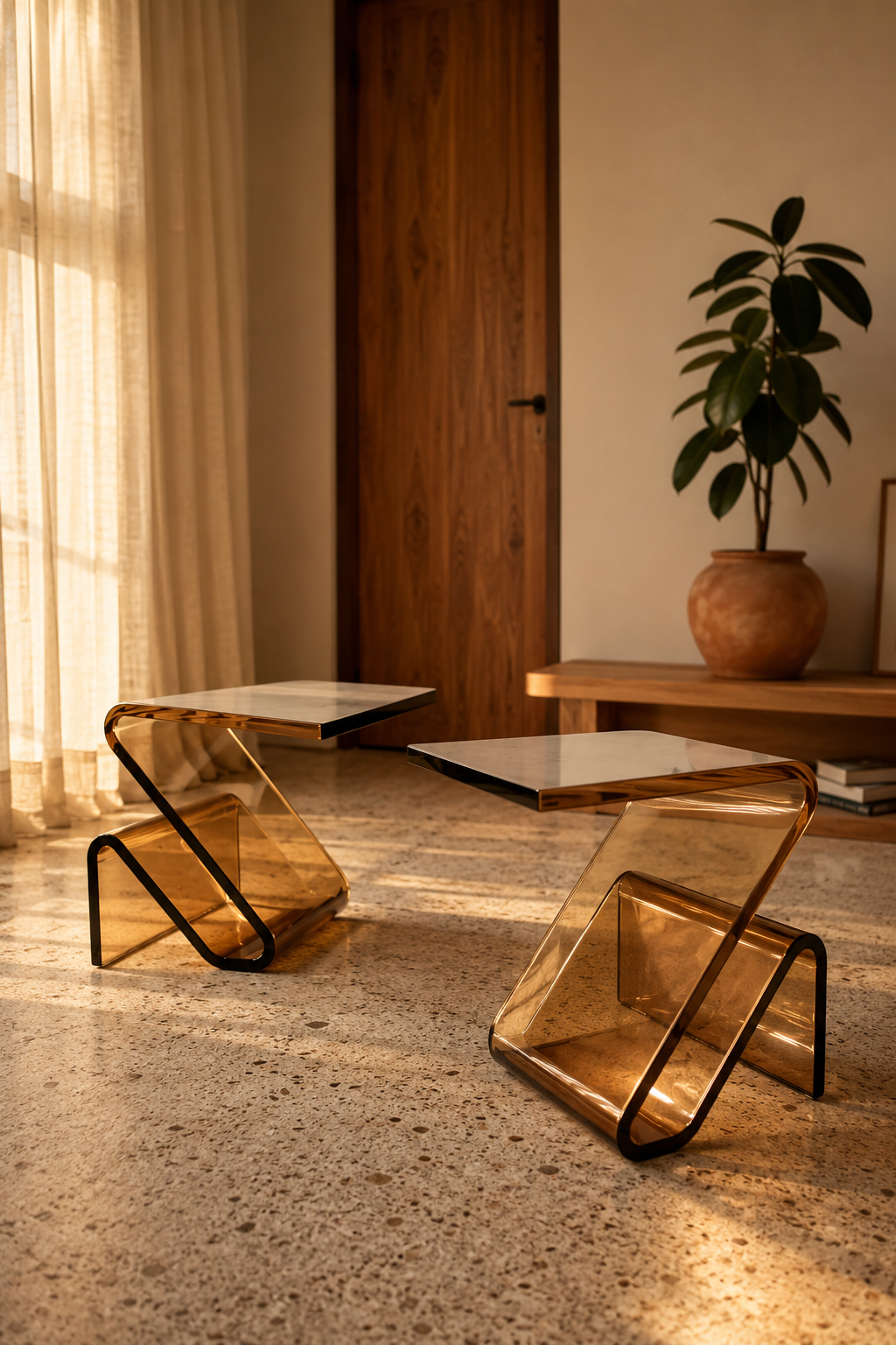
Acrylic side tables are useful when a room needs function but not more visual weight. Clear acrylic nearly disappears; amber acrylic does something warmer. It catches light, adds a honey tone, and still keeps the floor feeling open.
In our room edits, the change works only when it solves a visible problem instead of adding another layer to manage. Use the same restraint behind travertine coffee table ideas and clear acrylic display risers: measure first, repeat materials deliberately, and leave enough blank space for the change to read.
The best versions are simple enough to live with but sculptural enough to earn the material.
Where acrylic makes sense
Use acrylic beside a chunky sofa, in a narrow walkway, beside a lounge chair, or anywhere a solid wood table would block the eye. It is especially good in small apartments because the table can hold a drink or lamp without making the room feel more crowded.
Amber works better than clear acrylic in warm interiors. It relates to wood, brass, rattan, and golden light, while still feeling modern.
What to check
Check thickness and edges. Thin acrylic can look temporary and scratch quickly. Rounded or polished edges feel more intentional and are safer in tight spaces.
Check color in daylight. Amber can range from soft honey to bright orange. For a calm living room, choose the quieter side of the range.
Check footprint. Sculptural bases often take up more floor space than the tabletop suggests. Measure the widest point, not just the top.
Styling rule
Keep the tabletop sparse. Acrylic shows everything: fingerprints, dust, coasters, cables, and clutter. One lamp, one book, or one ceramic dish is enough.
If the table is amber, repeat the color once with a candle, cushion, wood frame, or warm-toned art. A single repeat makes the choice look designed.
What to skip
Skip acrylic in rooms with heavy daily abuse unless you are comfortable with patina. It can scratch. That does not make it wrong, but it does mean the piece suits adults, reading corners, and occasional tables better than snack-heavy family zones.
For this choice, this section matters most when it is checked from the doorway and from the seat or counter where the decision will be seen every day. Give the idea at least 24 hours in normal morning and evening light, then remove one nearby object before deciding whether the room needs anything else.
Clear versus amber
Clear acrylic is almost invisible, which can be useful in a very small room. Amber acrylic is more decorative. It adds a warm note and can make a minimal room feel less cold without adding wood.
Choose clear if the room already has enough color and texture. Choose amber if the room is pale, modern, and missing a little glow. The amber version works especially well with terrazzo, white walls, warm wood doors, cream upholstery, and black accents.
Shape and proportion
Sculptural acrylic tables often have curved or folded forms. Those shapes are the point, but they still need to be practical. The top should be large enough for a glass, book, or lamp. If the table only works as sculpture, treat it as sculpture and do not expect it to solve a seating problem.
Two small tables can be more flexible than one larger table. They can sit together as a nested pair, split between seats when guests arrive, or move beside a reading chair. In small rooms, movable furniture often earns its place faster than fixed furniture.
How to keep it from looking cheap
Acrylic looks best when the surrounding room has at least one natural material. Pair it with linen, wood, stone, wool, or ceramic so the table does not make the room feel plastic. The contrast is what makes acrylic elegant.
Keep the edges clean and the surface uncluttered. Fingerprints and dust show quickly on glossy materials. A microfiber cloth nearby is not glamorous, but it is the difference between a crisp modern piece and a neglected one.
Lighting matters
Amber acrylic changes through the day. In direct sun, it can glow beautifully. Under cool overhead lighting, it can look orange or flat. Test the table near the light it will actually live with, not only in product photos.
At night, place it near a warm lamp rather than under a bright ceiling light. The material is at its best when it catches low light from the side.
Styling combinations
Pair an amber side table with a cream sofa and one darker anchor, such as a black floor lamp or walnut frame. If everything around it is pale, the table can look like the only object in the room. A darker note gives it context.
Avoid pairing it with many other translucent pieces. Acrylic table, glass lamp, glass vase, and glossy tray together can feel slippery. One clear or amber element is usually enough.
How to Use Acrylic side tables at Home
Start with measurements rather than mood. Mark the likely footprint with painter's tape, books, or a folded towel before buying or rearranging anything. A useful rule is to leave at least 60 cm for a main walkway, 35-45 cm between a sofa and coffee table, and 10 cm of visible border around small textiles or objects that sit on the floor. Those numbers are not decorative; they decide whether the idea feels calm once people actually move through the room.
Check the material against what is already present. If the room has several glossy surfaces, add matte texture. If it has many pale fabrics, add one grounded wood, stone, black, or brass note. If it already has strong contrast, keep the new piece quieter. The goal is not to match every finish, but to repeat one material family so the choice feels connected to the room instead of dropped into it from a product photo.
Plan maintenance before styling. Anything near water, food, pets, children, or direct sun needs a cleaning rhythm and a tolerance for wear. Soft textiles may need weekly washing, stone may need coasters, acrylic may need microfiber cleaning, wood may need pads under objects, and lighting may need a dimmer that is compatible with the fixture. A beautiful choice that is annoying to maintain usually becomes visual clutter within a month.
Use the one-in, one-out test after the change lands. Add the new piece, then remove one smaller object in the same sightline. If the room feels more intentional, leave the smaller object out. If the room feels bare, return it after a week. This keeps the edit from turning into accumulation and protects the calm that made the change worth considering in the first place. Used this way, acrylic side tables becomes part of the room's structure rather than a loose accent.
FAQ
How do I use this idea without making the room feel busy?
Use the change as one clear decision, then remove or quiet the nearest competing object. The room should gain a job, a material note, or a focal point rather than another small thing to maintain.
What should I measure before choosing it?
Measure the available width, depth, height, and the walkway that remains after the piece or idea is in place. For most rooms, 60 cm of clear passage and visible breathing room around the object prevents a styled choice from becoming an obstacle.
Can this work in a rental or small home?
Yes, if the choice is reversible and scaled to the room rather than the product photo. Freestanding pieces, textiles, plug-in lighting, removable hooks, and careful styling usually give the best result without changing the building.
What is the most common mistake with this idea?
The common mistake is treating the idea as decoration before checking proportion and maintenance. If the size is wrong or the material is hard to live with, even an attractive choice will make the room feel less settled over time.